By Andrew Kyne
Home runs are being launched at unprecedented rates in Major League Baseball. In 2019, there has been a home run hit once every 28 plate appearances — which if maintained would be the highest frequency for a season in history, followed by 2017 (1 every 30), 2016 (1 every 33), and 2018 (1 every 33).
My colleague Mark Simon and I were curious about what home run heat maps look like in today’s MLB compared to several years ago. Let’s take a look, using methods similar to what Jim Albert has demonstrated.
The following heat maps show the probability of a swing resulting in a home run, given a pitch’s location. It excludes bunts, as well as pitchers hitting.
The colored areas begin at a 1.5% probability, and darker red indicates a higher likelihood. Locations are from the pitcher’s perspective.
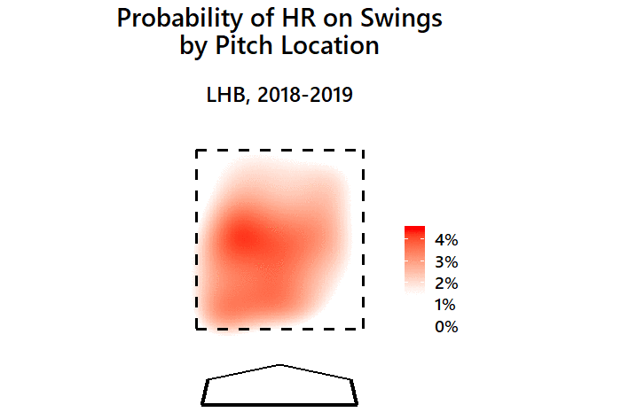
First, for left-handed batters in 2018 and 2019:

Pitches right down the middle/over the inner-third generate the most homers per swing. Pitches low in the zone tend to generate more HR compared to high or outside.
But that’s intuitive — you could probably picture that one without even seeing it. What we’re more interested in is how that’s changed from when home runs weren’t so common.
Here’s what it looked like for left-handed batters in 2013 and 2014:
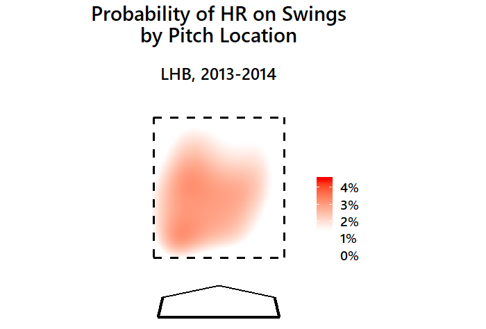
This heat map uses the same scale as the previous one, so not only is the area much smaller, but the red isn’t as dark (indicating lower probability).
Here’s a GIF to compare them back-to-back:
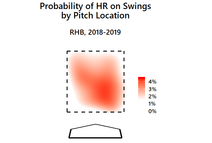
Now, here’s the heat map for right-handed batters recently:
And right-handed batters five seasons ago:

And in GIF form:
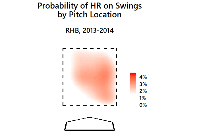
Hitter hot zones are certainly expanding. And while differences may seem small — 4 home runs per 100 swings rather than 3 per 100 in the best spots to hit, or 2 per 100 rather than 1 per 100 on the edges — they add up considerably in the aggregate.


